Scandinavian design is renowned for its refined and understated color palette. Among the most popular colors are neutral tones such as white, gray and beige, which create a versatile and sophisticated base. These shades, in addition to bringing a sense of brightness and spaciousness to rooms, allow for easy integration of decorative elements and furniture of different styles and materials.
However, neutral colors are by no means the only colors allowed inside Nordic homes, and design history confirms this.
Let’s explore a palette of possibilities together as we discover color ideas for your Scandinavian home.

The influence of Bauhaus colors on the Scandinavian palette.
The influence of the Bauhaus, an artistic and architectural movement founded in Germany in the 1920s, has left a significant imprint on the color palette of Scandinavian design. Bauhaus principles, which promoted the use of primary colors and the combination of geometric shapes, are reflected in the choice of bright and vivid hues found in some Scandinavian furniture and accessories.
Light colors to amplify light
It is true that light colors prevail on the walls of Nordic houses.
One of the distinctive elements of Scandinavian design is precisely attention to natural light and its optimization within living spaces.
For this reason, light colors such as white, beige and pastel shades are widely used on walls to amplify the brightness of rooms and to create an airy feeling.
These bright colors are able to reflect natural light, so as to emphasize it to the maximum especially during the long winter months when it is in short supply..
Soft dark or medium bright colors
The neutral, light-colored base leaves plenty of room to maneuver for color combinations.
While most walls are usually (but this is not a fixed rule) light, the main furnishings often feature both dark and medium-light pigmented hues.
This is the case, for example, with fabrics that cover important surfaces such as those of a sofa or bed, but also with the materials that make up the kitchen, which often feature pastel colors, or darker, more intense hues such as smoky gray, black, forest green, or shades of blue.
Colorful Scandinavian design objects
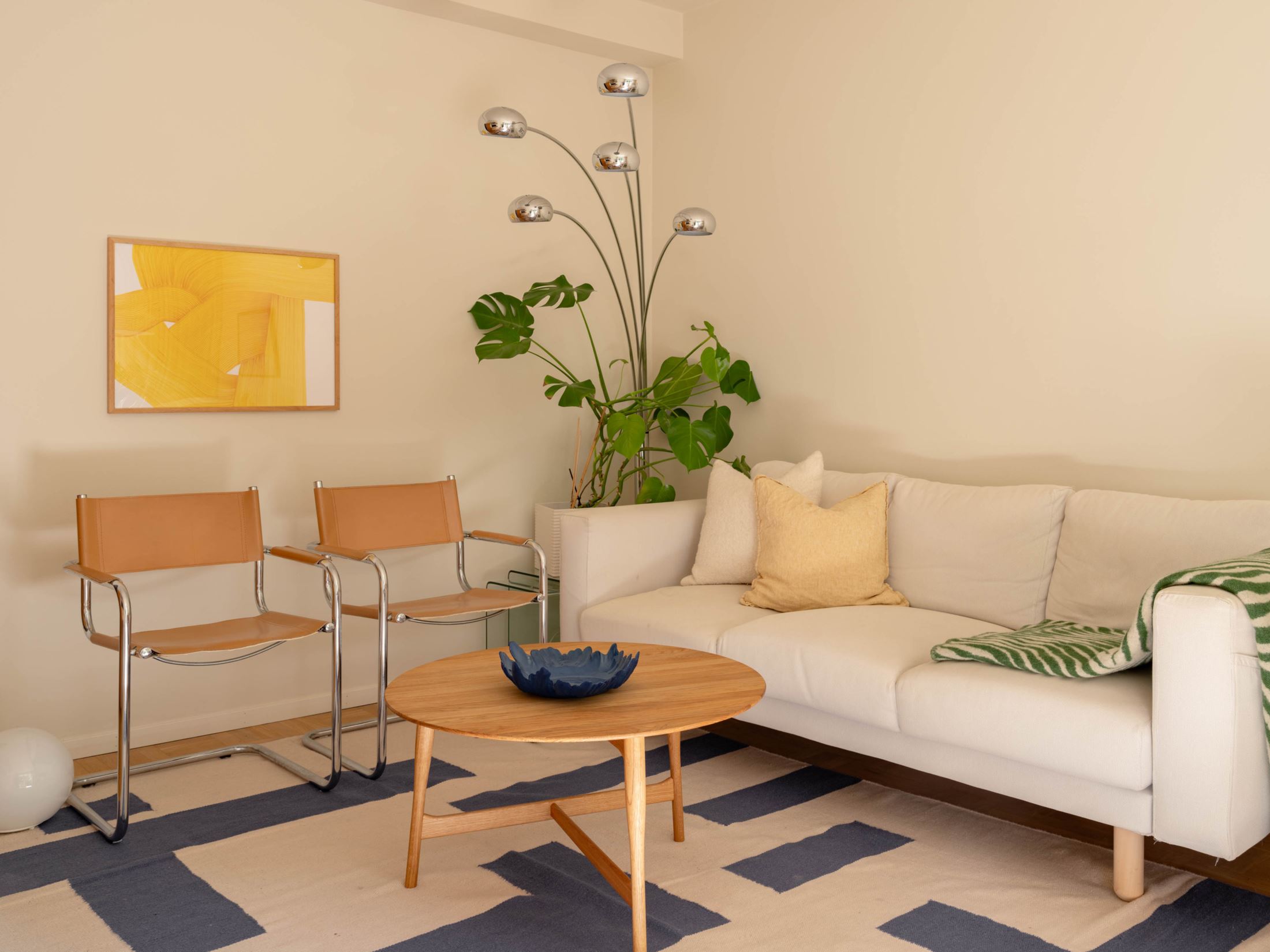
To complete the look, accents in bright, bold hues are perfect.
There are numerous examples of colorful objects that have made Nordic design history.
Prominent among them are the famous Panton chairs, also produced in 1968 in red, orange, yellow, green and blue, and the Scandinavian lamps designed by artists such as Arne Jacobsen, Poul Henningsen and Anders Pehrson, characterized by bold colors and futuristic shapes.
This is the case, for example, with the lamps PH5 vintage or of the lamps Bumling, which are very often found in Scandinavian homes in orange, yellow, green or red.
These iconic objects demonstrate that saturated colors can be successfully used to create bold focal points e add vibrancy to Nordic interiors, without compromising the elegance and restraint typical of the Scandinavian mood.
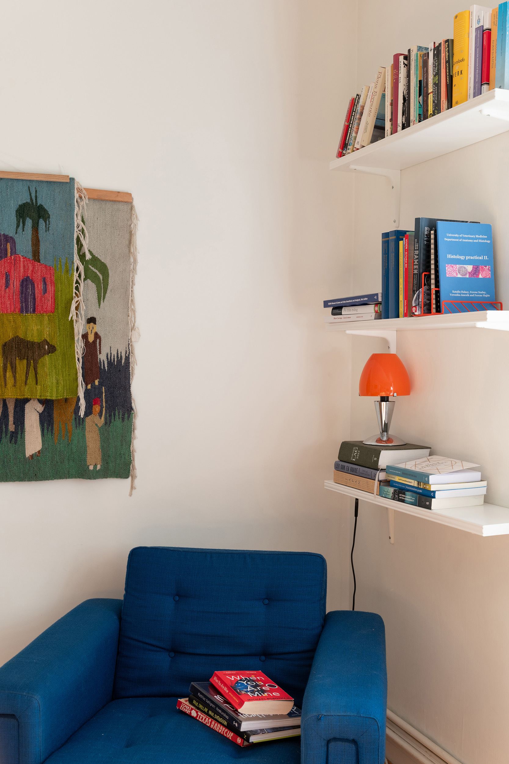
10 Scandinavian interior wall colors: choose your favorite shade
To give individuality to your interiors inspired by Scandinavian houses, the choice of wall color is crucial. Are you looking for ideas?
Here is a selection of 10 colors popular that perfectly complement the Nordic style.
- Sugar paper blue: This delicate and soothing shade is reminiscent of a clear sky and conveys a sense of calm.
It looks great with teak and rosewood furniture typical of Scandinavian design.
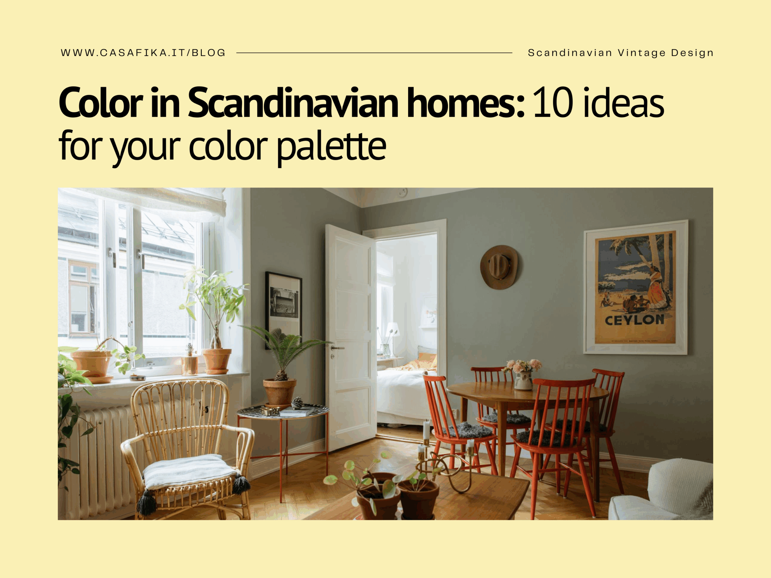
It is perfect in the bedroom, precisely because of its relaxing power, but it also looks very good in the living area, especially when placed next to a teak table and/or furniture such as sofas or blue chairs. It also works well with neutral, earthy-colored furnishings such as taupe and beige. - Sage green: cool and welcoming, sage green adds a note of nature to Scandinavian interiors, creating a peaceful atmosphere.
Sage is suitable for both sleeping and living areas and is at its best when paired with dark wood essences and natural fibers, creating a refined mood that keeps the natural dominant.
In short, if you love furniture consisting of the combination of rattan and wood, like this 60s trolley, a sage green wall is a great option to consider for your walls. - Celadon: a delicate and sophisticated color, celadon is a soft blue green. It lends a touch of elegance and serenity to rooms, making them more welcoming and comfortable. It is the perfect match for orangey wood essences (such as the one in this Swedish teak highboard original from the 1960s), but also with mahogany wood (like that of these Swedish Modern nightstands, perfect for a celadon bedroom), with its enveloping reddish hue.
It is easy to mix with blues and brighter greens. The result is always very fresh.
- Beige: neutral and versatile, beige is a classic choice for Scandinavian interior walls. It creates an elegant and understated base for furniture and accessories.
A classic, which goes well with everything: steel and gold, but also all warm, dark woods, such as rosewood. It envelops and indulges them, enhancing them. - Smoke gray: for a touch of drama and depth, dark gray is a bold yet sophisticated choice for the walls of Nordic interiors. It adds a touch of elegance and modernity.
Smoke gray is perfect for enhancing vintage Scandinavian furniture consisting of yellowish wood (like the one in this vintage sideboard cabinet with double door) or orangeish (like the one in this vintage bookcase). - Midnight blue: rich and enveloping, midnight blue adds mystery and character to spaces, creating a relaxing and welcoming atmosphere. It looks good with all, but really all types of wood in vintage Scandinavian furniture. From light wood, typical of furniture designed by Alvar Aalto, such as the Model 45 chairs, at teak.
- Browns: earthy shades of brown bring warmth and comfort to Scandinavian interiors. Warmer shades, also look great with duller, grayish woods.
Combined with bouclé wool, canvas, wicker, burlap and other natural materials, it creates a very comfortable and enveloping mood. In this natural guise, brown is ideal for creating a mood Japandi. - Powder pink: Powder pink adds a touch of sweetness and femininity to interiors, creating a soft and romantic atmosphere. Universal, it looks good with greens, blues, all types of wood and black.
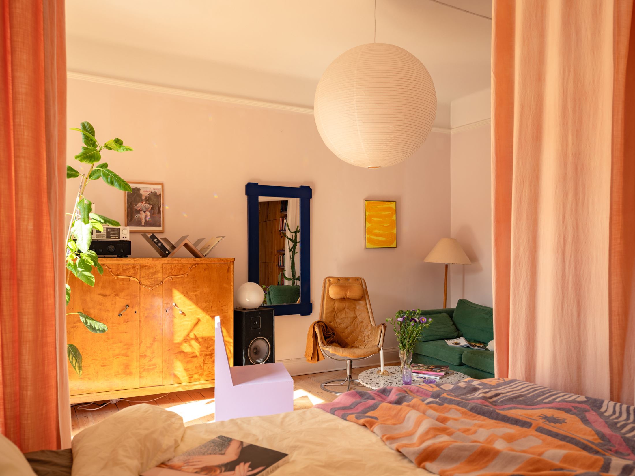
A very elegant result is achieved by mixing powder pink with very dark wood furnishings, such as these Scandinavian chairs. - Straw yellow: bright and vibrant, straw yellow brings joy and vitality to Scandinavian interiors, creating a bright and positive atmosphere. It goes along with orangey wood, is divine with the natural wood, but also looks good with dark woods.
- Pistachio green: fresh and vibrant, pistachio green adds a hint of freshness and vibrancy to spaces, creating a cheerful and bright space. It looks great with natural wood and with the furniture covered in other shades of green.
By choosing from these shades, you can personalize the interior of your Scandinavian home and create an environment that reflects your style and personality.
Recap: color as an essential element of Scandinavian design
Color plays a key role in Scandinavian homes.
To recap:
– the choice of neutral and bright shades focuses attention on natural light;
– the use of colorful accents, through chairs, decorations and designer lamps from the Scandinavian tradition, adds cheerful and modern touches to the rooms;
– the dark or medium-light soft shades can be used for main furnishings or an accent wall, creating contrast and character without compromising light.
In short, the widespread idea that Scandinavian interiors are only white or neutral does not correspond to reality at all.